
By Diana Zipeto

Recently, I bought Mariana Ruiz Johnson’s beautiful picture book, I Know a Bear.
Published in 2014 by Schwartz & Wade, the book is about a girl who visits a bear in the zoo. At the end of the story, after hearing the bear’s longing for his days of freedom in the wild, the girl decides to go home and set her caged bird free.
I Know a Bear was previously published in 2011 in France, under the title, J’ai un Ours (I Have a Bear). I thought the slight difference between the English and French titles (Know vs. Have), was interesting and wondered if there were other differences between the two books.
Images inside the book revealed differences between the French and English versions, most notably removing the bird character in the English version until the end of the story. This is an interesting choice since the bird isn’t literally in the story until the end when the girl goes home to free it; however the French version takes license and introduces the idea of the bird in the earlier imaginative spreads when the bear is telling his story.
Cover Art
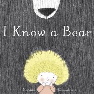

The two covers are an interesting example of art direction choices. The earlier French version shows the girl against a backdrop of dark fur, focusing solely on the girl’s experience and showing the bear’s great size. The English version adds the bear’s muzzle to the image, possibly to give the bear fur more literal context and offer an element we can connect with (the face). It also adds another interesting shape into the design.
The French version uses a hand drawn font, which is very similar to the sketchy look of the illustrations, while the English version uses a more formal font that contrasts with the sketchy linework.
Illustration Revision
What I also found interesting were differences between early and later versions of the book’s images for the French publication. They are great examples of how revisions in illustration vastly help the overall flow of an image in service of page design and story.
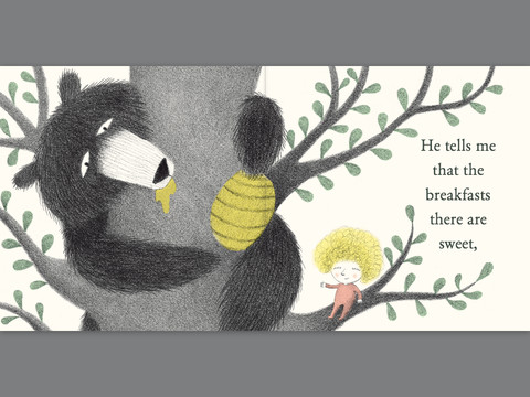
“He tells me that the breakfasts there are sweet”
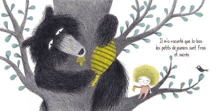
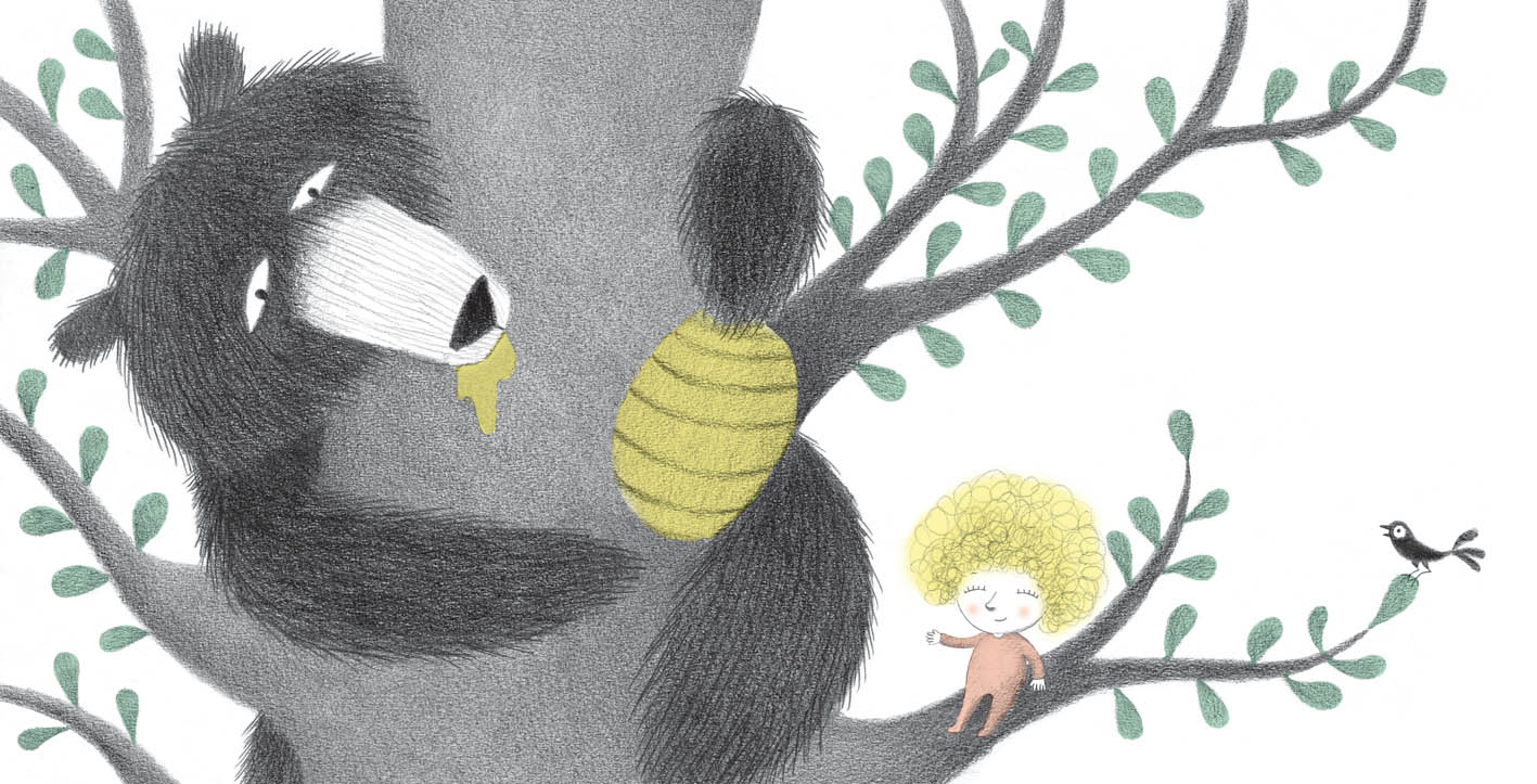
In Version #2, Johnson has rounded out the honeycomb with curved lines and made it a bit smaller. She’s also moved the bear’s head back from the honeycomb, giving more breathing space in the image. She made the head larger, more rounded and friendlier. In version #2, the size relationships between the bear’s head, the honeycomb and the girl’s head now feel more like an interesting hierarchy, whereas before they were competing with each other by all being a similar size.
Johnson has also simplified the bear’s arms into more pointed, defined shapes, which helps direct our eyes clearly towards the honeycomb. The honey here is only on the bear’s mouth, Johnson removed it from the girl’s hand and the honeycomb, possibly to simplify the image in service of the story. Because the bear’s head was moved, the tree branches behind the bear’s head are more obscured and simplified, all which helps with the design of the page.
An overall lightening of the bear’s dark fur makes the whole image more unified, and the bear more friendly.
“Naps last for months and months. This is what he tells me.”
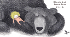
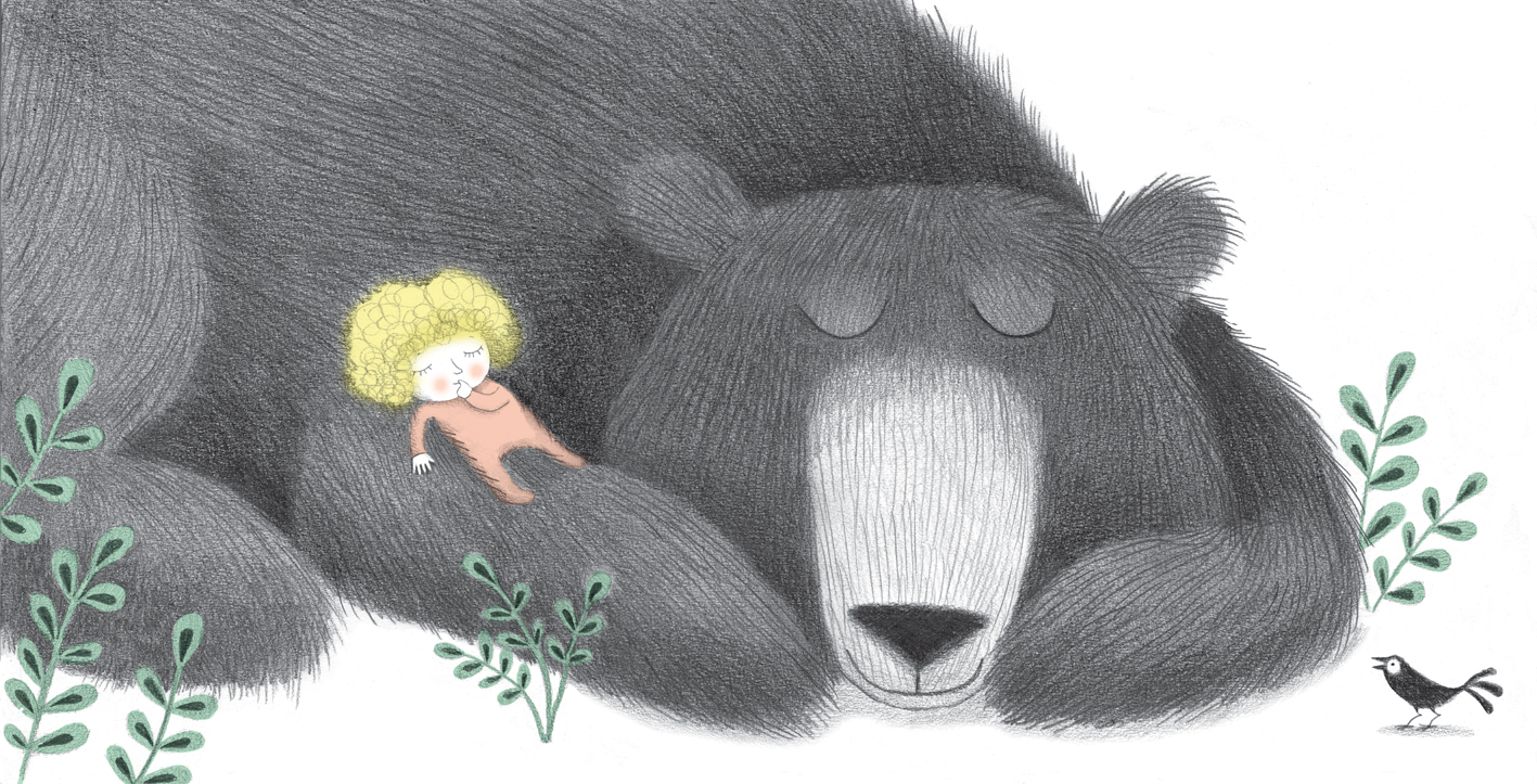
Here, Johnson made changes similar to the honeycomb image: the bear’s head and ears have been curved into friendlier, distinct shapes. His eyes have been moved slightly apart, muzzle elongated, all of which help him become more individual and more lovable. Johnson has redrawn the bear’s arm to make his resting posture more relaxed and weight bearing – you can feel him resting on his forepaw. The angle and softness of the fur has changed, helping the composition and better defining the bear’s form. The addition of plants helps the design of the page, linking it to a setting and to the other images in the book. Reducing the shadow under the bear and bird helps to clean up and simplify the image.
Johnson also refined the girl’s body and arm, making it smaller in relation to the head and softening the dark sketchy lines.
Our Own Illustrations
Having the opportunity to look at art direction choices and illustration revisions in published books can be very useful in making illustration choices in our own books. Subtle tweaks in shape and position of characters can make the story and impact of a spread that much clearer and stronger. Using clear, simplified, contrasting shapes can make a character go from “eh” to lovable and elevate the entire book experience.
It is also interesting to look at art direction choices made by different publishers who publish the same book. What is acceptable and interesting in France may differ from what is going to sell in the United States. Or it may be the vision of a particular art director, rather than a cultural divide, that makes the difference in how a cover looks or illustration choices are made.
 Diana Zipeto is an illustrator and designer living in an energizing artist community in Lowell, MA. You can see her work at http://www.dianazipetoillustration.com. She has most recently illustrated books in the Olive and Max series published by Schoolwide, Inc.

Diana, I liked your in-depth comparisons between the two versions. It’s an informative exercise in really “seeing” rather than just “looking at” a book.
LikeLike
I learned so much about the idiosyncrasies of illustrations. I’ll never look at a PB the same way ever again.
LikeLike
Thanks for this post, Diana. I really enjoyed reading your thoughts on different illustrations and the book looks darling!
LikeLike
Fascinating to compare the two versions and ponder what spurred the revisions!
Thanks Diana.
LikeLike