

This article is mostly about separating colors for print by hand (about which David Weisner has said “Horrors!”), as was done years ago. And a bit about now.
Were you aware that all full color art is actually printed using only four colors of ink – cyan, magenta, yellow, and black, in different shades to make the full range of colors? Aha! That explains the CMYK option in your digital image program, doesn’t it. The other option, RGB, is for art that will be viewed only on screen. So CMYK is for full color art that’s to be printed, as in a book.
How is each piece of artwork separated into CMYK? Now PhotoShop, Illustrator and other image programs can do the separations for you. Cinchy. But back in those “olden days” illustrators often did the work. Sometimes there were only two colors or three in the budget and those books had a certain look. Four color books of course had the potential to look most realistic, however required the most effort. For each of the four colors you would need to paint or draw a new layer. And get this, as David explains in the link below, you did each in black and white and shades of grey, not in the color they would print. How’s that you say?
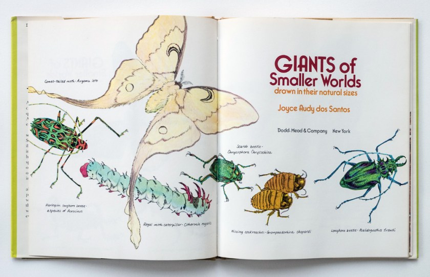
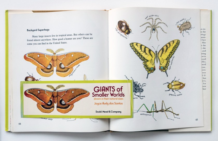
Here is the title page of a printed book I wrote and illustrated a while back. Looks relatively normal (except for the quirks of photography).
 Here is the magenta art layer rendered in black and greys on watercolor paper.
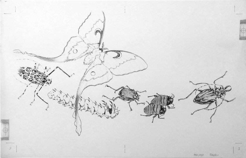
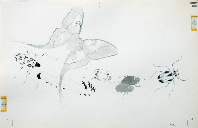 The cyan.
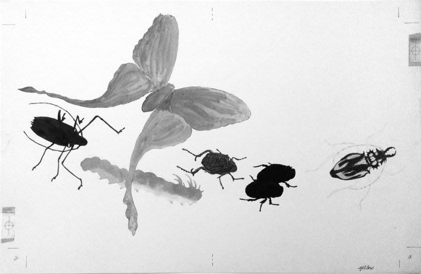
The yellow.
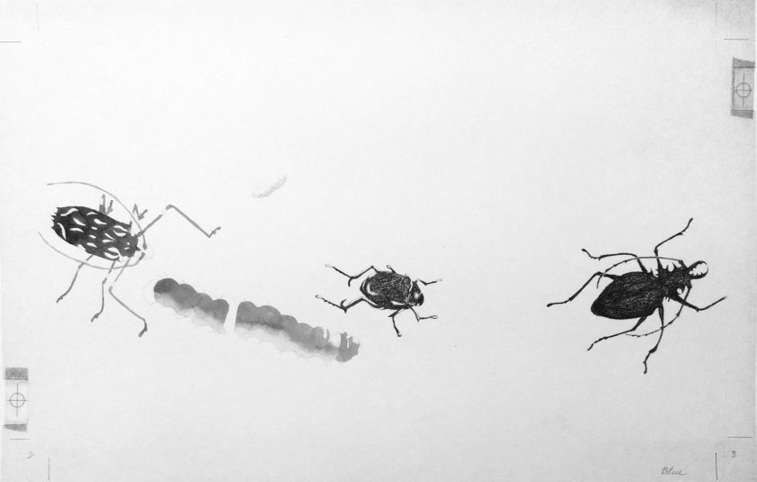
And the black.
Once the separations were painted it was time to hope they were done correctly. The printer’s camera created the negatives, which were used to make the printing plates, and when the correct color of ink was put into one of the four rollers on the press, voila.
Why was this laborious technique required of illustrators? It was all about saving money. At the time I was a single parent supporting three kids, so I said okay. My editor assured me I would have more control over the aesthetics of the book.
We did a test run first, of separations for a bookmark and the cover. Here’s the bookmark next to the same art as it appeared in the book. Notice the difference?
At the printer’s – back in the day when American children’s books were nearly always printed in the USA – I looked at the press sheet for the entire book. The black printing plate was obviously under exposed so all the art for 48 pages looked paler than it should have. The editor said it would be too expensive to redo the black plate….no one would notice but me. So much for having more control.
Aren’t you loving that you don’t have to go through that? But hold on, why do you need to know about hand separating then? Well, there are still times when limited color certainly is handy. It can be an option to make the art distinctive. And now it’s easier to do with digital wizardry.
Do you think this book cover stands out on a bookstore shelf? Three colors of ink – black, pink, and metallic. Illustrated by ohgigue. I looove this jacket art. It’s a great YA novel too.

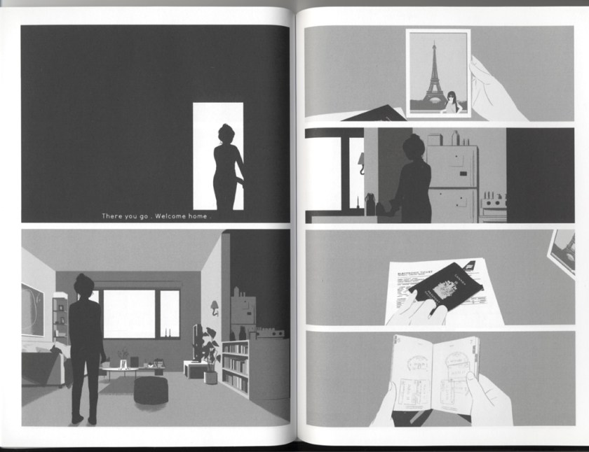
And this unusual graphic novel is by the same illustrator though under the name gg. (She likes pink, eh.) The interior art uses a full range of greys, not unlike the black plate for the insect book.
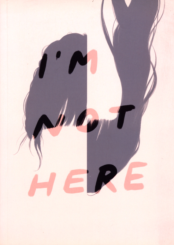
How about this next awesome graphic novel? It’s only one color, though smartly not black. The illustrator chose a deep, dark blue PMS color. Technically that’s not a separation technique, but it does show that she understands how to maximize limited color to stick within a budget yet make her art stand out.
So, while full color is easy now, knowing a bit of print production history has its benefits.
Check out David Weisner’s blog post here about his experience.
Here is a glossary of color separation terminology.
How-to tips for separating color in Illustrator and PhotoShop.
More pre-color-separation examples on Writers’ Rumpus: These Wouldn’t Be Published Today by Marianne Knowles

Joyce, WOW, this is a fantastic post with gorgeous examples. I did not know that illustrators did the plates by hand; I was only familiar with rubies that placed blocks of the same tone throughout a specified area. I can only imagine the painstaking work it was to register each of the layers plate by plate. Thanks for this treasure!
LikeLike
Thank you, Marianne. What you are referring to is the method used for flat color, for which the illustrator would indicate a Pantone Matching System (PMS) color rather than the CMYK paradigm. Those overlays were much simpler, cut from rubylith. Yes, hand separation was a technique that required patience. A good trait to have! Thank you for your appreciation.
LikeLiked by 1 person