
By Sarah Lynne Reul
Last summer, I was honored to be selected as the illustrator for the NESCBWI17 logo. The logo is used as a Facebook header, profile icon and general illustration to represent the conference’s theme, which for this year will be “EXPAND & DIVERSIFY YOUR PORTFOLIO.”
I’ve attended two NESCBWI conferences and found both to be incredibly inspiring and engaging. For the logo, I wanted to capture the whirlwind of enthusiasm that I’ve experienced – the engagement with other writers and illustrators, learning about new tools, tips and tricks, the ignition of renewed inspiration, the illumination of fresh ideas. Of course, I also wanted incorporate portfolio expansion and diversification, as per the theme!
My first inclination was to attempt to pack everything into the illustration, but I knew that I’d have to narrow it down in order to communicate clearly. Going back to my method of creating multiple iterations, I decided to present the illustration coordinators with four separate rough concepts. As you’ll see, the final piece was pretty different from any of these initial ideas, but working through them helped us get to the final design together.
For the first two concepts, I did some rough handlettering in the style of vintage neon lights – I’ve been really inspired by images of signs and will often sketch them when I need a little daily drawing practice.
The first concept focused on diversification of ideas -different shaped lightbulbs for different people. This one is pretty heavily influenced by the iconic designs of Saul Bass. 
The second concept riffed on idea of “gems” – those treasured keepers of a developing portfolio, no matter what state they’re in – rough cut, unpolished, finely chiseled or otherwise! 
Concept number three focused on imaginary writer/illustrator creatures, each with their own magic cloud of inspiration and experiences: 
The final rough concept also included writer/illustrator creatures (I guess I have a thing for monsters), but this time they were sharing tools and ideas to help each other expand their portfolios: 
For the final design, the coordinators requested the incorporation of children, as well as a layout more similar to an undersea creatures pattern I had created for another project. That design went through a few iterations of its own – here’s a quick process gif to show how I went from rough to final:

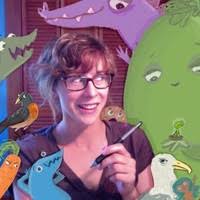
And here’s how the final came out – many thanks to Denise Ortakales, Milanka Reardon, Josh Funk & Heather Kelley for this great opportunity!

How do you use iterations in your writing and illustration work? Does your final product usually stay pretty close to the initial concept or does it take a long and windy path?
Registration for NESCBWI opens on 2/4/17 at 2pm and the conference is in April – hope to see you there!
 Sarah Lynne Reul is an illustrator, writer and award-winning 2D animator who likes science, bright colors and figuring out how things work. Learn more at reuler.com.

Turned out great!
LikeLiked by 1 person
Wonderful to see your imaginative process, Sarah! LOVE the finished product! Congratulations!
LikeLiked by 1 person
Sarah, the logo is fantastic! So proud of you. And my writing often takes a long and winding path away from my first draft.
LikeLiked by 1 person
So fascinating to see your process, Sarah! Thanks for sharing.
LikeLiked by 1 person
So fun while also inspiring!
LikeLiked by 1 person
I love it!
LikeLiked by 1 person